Mediacenter Sarajevo published an interesting article by Prof. Ph.D. Ismar Volić entitled "Traps in the interpretation of statistical data." Why the misuse of statistics has serious consequences, especially in the era of "post-truth," "alternative facts," and conspiracy theories, you can read below: Misuse of statistics has serious consequences, especially in the era of "post-truths", "alternative facts" and conspiracy theories. Photo: Pixabay Science of the 21st century is largely based on data and statistics. The correct presentation of science in the media is therefore inseparable from the correct interpretation and understanding of statistics. There are various definitions of statistics, but they are all related to the collection, analysis, and interpretation of data. The goal of statistics is to quantify and manage uncertainty and risk and to make predictions based on past events. Given that the future can of course never be fully predicted, statistics always contain a dose of uncertainty, which leaves room for manipulation and abuse. Such abuse has serious consequences, especially in the age of "post-truth," "alternative facts," and conspiracy theories. Some of the ways statistics can be manipulated are:
In this text, we will give some examples of these phenomena that can serve as a warning and call to journalists to be more careful with the mathematics and statistics they encounter while reporting on science. Finally, we will look at some questions that should help journalists when thinking about statistics. Misleading Visualizations 1: In this chart, it looks like the interest rate has risen sharply from year 2008 to 2012: 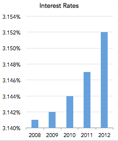
However, the vertical axis starts at 3,140%, which makes no sense because the installment can be smaller than that value. If the axis starts from zero, as it should, then the chart is much less dramatic: 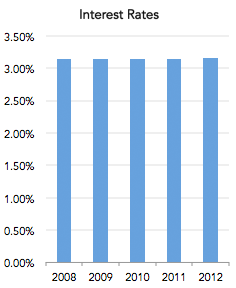
Misleading Visuals 2: This chart shows cumulative iPhone sales: 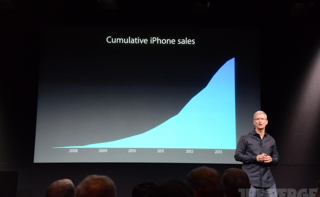 The problem is that this chart will always grow because it shows the total sales up to that day. An upward trajectory certainly looks good, but it does not represent the picture of sales in any specific period. Also, there are no markings on the vertical axis, so we don't know if the value of sales is in thousands, millions, billions... A better visualization is this one, because in addition to cumulative sales, it also displays sales by quarter, and it shows that sometimes sales decrease compared to the previous period:
 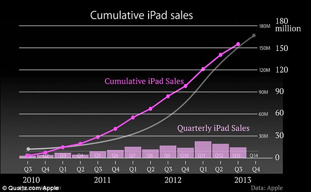 Misleading visualizations 3: This graph tries to downplay the fall in unemployment in October and November 2011. The scale changes abruptly at the end of the graph where 8.6% is roughly at the same level as 9.0%:
 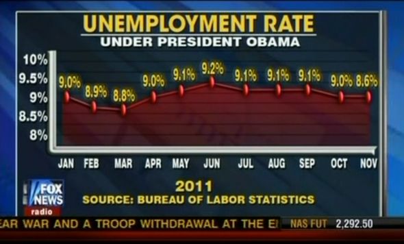 If 8.6% were actually placed where it belongs, i.e. just above the horizontal line leading from 8.5% on the left, then the graph would look like this and the drop in unemployment would be more evident:
 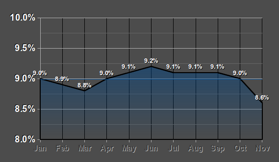 Misleading Visualizations 4: This pie chart doesn't make sense because, when the numbers are added up, it adds up to more than 100%. The cake cannot be cut into pieces that are then together larger than the initial cake:
 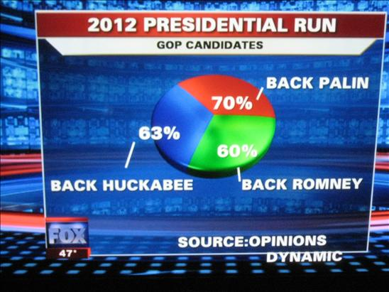 Misleading visualizations 4: Climate change deniers often show this image, claiming that it proves that the average temperature is not changing and therefore global warming is just a fabrication:
 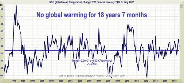 The problem is that the time interval is very precisely chosen, and that should be of immediate concern. When we talk about climate change, we are dealing with processes that last decades and centuries, so carefully chosen intervals are doubtful. Indeed, this interval began right after the El Niño heat wave of 1998, which caused unnaturally high temperatures, so that in subsequent years temperatures were relatively lower. The real trend is this:
 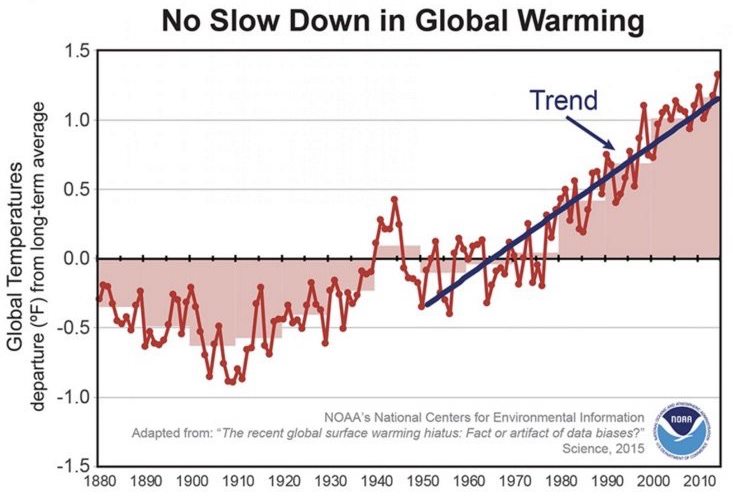 From this picture, of course, it can be seen that the global temperature is generally increasing. Overgeneralization: In one of her speeches in 2012, Nancy Pelosi (the first person of the Democratic Party in the US Congress) said that Obama's new health care plan would make "everyone pay less, have better care, and have better access to health care." One should beware of absolutisms such as "everyone," "all," "always," etc. because it is rare that a phenomenon has the same effect on all people. It is true that on average people pay less under Obama's health care plan, have better care, and have better access to health care, but that average does not apply to everyone. For example, some 8% of people now pay more for healthcare. One should be wary of any statistics that are supposed to apply to everyone, such as that everyone should drink eight glasses of water or take 10,000 steps a day. Number sense: Trump said in April 2020 that "America is testing more people for COVID-19 than all other countries in the world combined." At that moment, COVID-19 devastated China, Italy, and Spain and was present in 215 countries. It simply does not make sense that America, with 4.25% of the world's population, tested so much at that moment. America indeed tested more than any other country at the time, but it is false that it tested more than all other countries combined. Skepticism about this Trump statement should come from a general sense of numbers, big and small. This feeling is best achieved by putting the numbers into context with the help of analogies and metaphors. For example:
Definition of the term: In 2019, the American media reported a news story published by the American Heart Association, which stated that "48% of American adults will have some form of cardiovascular disease in their lifetime." This is a scary number, but it begs the question, What does “cardiovascular disease” mean? It turns out that this term includes mild and serious diseases, and one of them is high blood pressure, which can be controlled relatively easily. If high blood pressure is excluded, the number drops to 9%, which gives a completely different picture of the risk of cardiovascular disease. Relative and absolute risk: In 2017, the American Journal of Clinical Nutrition reported that eating French fries inflated the risk of death. That shocking news was reported by all major media. However, what is the underlying risk that is being absorbed? It turns out to be 1% for the group the study followed, a relatively small number that says one in 100 people in the study will die of something other than natural causes. Doubling that number gives another relatively small number, 2%. So the absolute risk sounds alarming, but when it is put into context and becomes a relative risk, then it doesn't seem so big anymore. The risk doubling information also doesn't tell us anything about causation; it just says that eating French fries and doubling mortality are correlated, but there may be other related factors that actually double the risk, such as eating junk food, inactivity, obesity, etc. Here is another example that illustrates this problem. Correlation and causation: In 2011, The Washington Post broke the news that drinking soda raises the rate of adolescent violence. This caused a flurry of reactions and measures, including many schools eliminating soda. However, when you look a little closer at the study from which the news was derived, it does not claim that there is a causation between soda consumption and violence, but only a correlation. Further studies found that the cause of both things is the socio-economic status of children—in poorer parts of America there is more violence, and their children drink more soda than elsewhere because the nutrition in such environments is generally worse, but the two factors are not directly causally related. consequent relation. COVID-19: The current pandemic has highlighted the importance of quantitative literacy and the role of the media in its proper and responsible communication. Flattening the curve, reproductive number, infection rate, death rate, false positive or negative results, modeling the spread of the virus, collective immunity, and vaccine effectiveness—these are all mathematical terms that are crucial to understanding and stopping the pandemic. We will conclude with three examples, but we will skip some of the calculations behind them.
At the time of writing, about 9,700 people have died from the coronavirus in Bosnia and Herzegovina, while in America that number is 606,000. America looks a lot worse, but that's only until these numbers are put into context. If we look at the death rate—the number of deaths per capita—then America has 1,860 deaths per million people, and Bosnia and Herzegovina has 2,950. The death rate in Bosnia and Herzegovina is 60% higher than the rate in America!
Let's assume that the antibody test is 90% accurate and someone tests positive. Does that mean there is a 90% chance that person has the coronavirus? No, because the real number depends on the infection rate, which is the percentage of the population that has the coronavirus. No one knows exactly this rate, but if it is, for example, 5%, then it turns out that the test will wrongly identify 66% of people as infected! This is called the base rate fallacy, and even many doctors do not understand the math behind this phenomenon.
What does it mean that a vaccine is "95% effective"? Does this mean that the chances that a vaccinated person will not get the coronavirus are 95%? No, this number means that the vaccine reduces the risk of infection by 95%. So if a certain number of people in an unvaccinated population are expected to be infected, then 95% fewer people are expected to be infected in a population of the same size in which everyone is vaccinated. For example, according to Pfizer's studies, 74 out of 100,000 unvaccinated people would be infected on average, while the number would be 4 in 100,000 vaccinated people.
What is most important, and what the media should have focused more on at the beginning of the coverage of vaccines, is that all vaccines almost eliminate the risk of more severe symptoms, hospitalization, and death.
All the above examples illustrate the danger of misrepresentation and manipulation of numbers, graphs, tables, and statistics that lurk on all sides. How can journalists protect themselves from this abuse? Here are some questions to ask if one wants to think critically about the quantitative aspects of journalism.
Of course, it would be even better if journalists knew enough statistics to ask technical questions that would rigorously indicate the validity of some data, such as:
The full capacity of science to help and improve humanity can only be realized through its effective communication, but numbers and statistics alone are not enough for that. Journalists therefore have a responsibility to ensure that they are properly framed and contextualized, that they represent reality, and that they are understood by readers. (https://media.ba)

 English
 Bosanski